
Pureology Superfood
marketing | Packaging
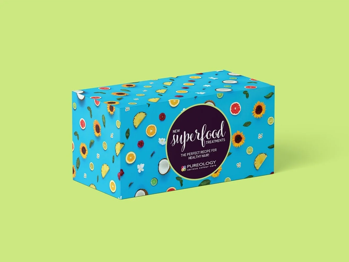
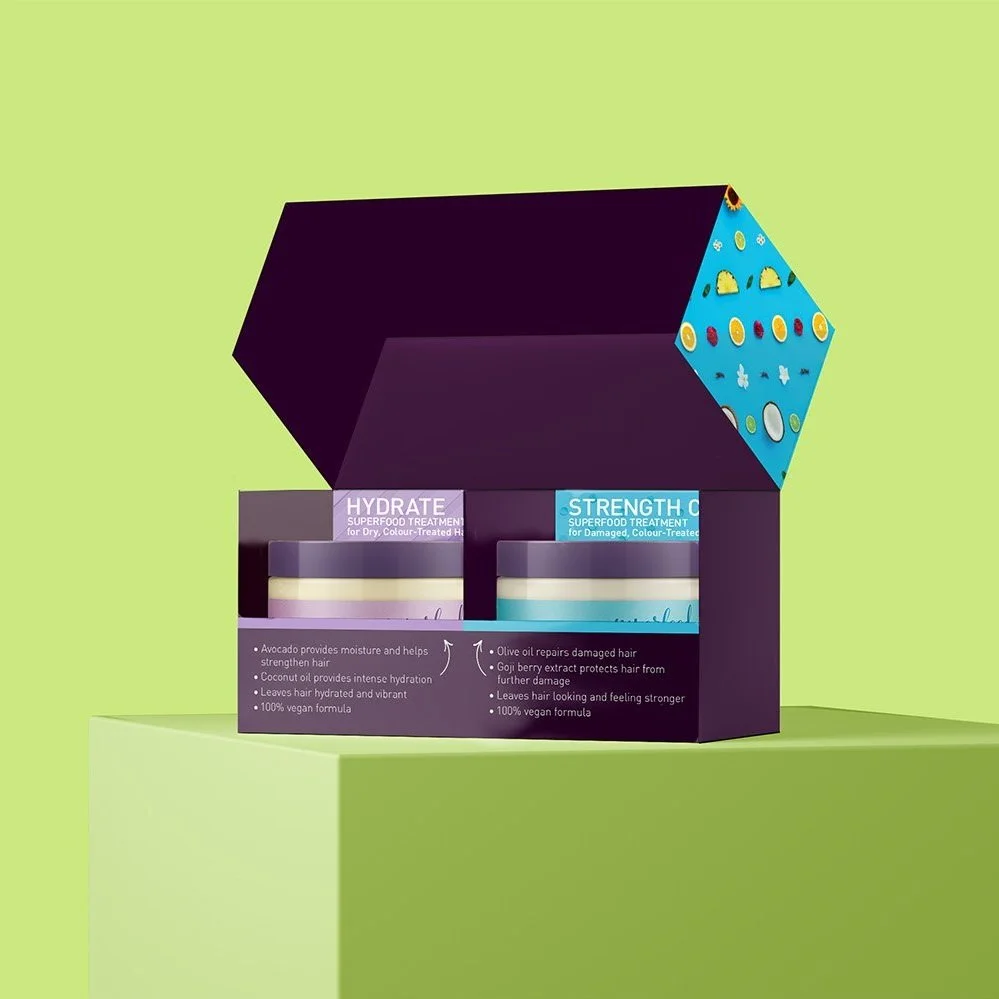
For Superfood Treatment Launch, we created a new visual for the brand with the emphasis on its pure and natural ingredients in the creams. Through a photoshoot, we created this ingredients pattern. With the line being focused on two products, Hydrate Superfood Treatment and Strength Cure Superfood Treatment, we used both of their colored patterns but made the green the main color to differentiate it from other launches and campaigns. I designed different marketing collateral such as preview box, brochure, and mirror clings. With production team, I worked with them to have the preview box have a shape in a way to showcase the products while having area to call out the difference between them.
creative director: Jordan Craddock, Tyler Ochs
art director: Megan Padden
graphic designer:Yuka Doyama
photographer: Peter Lueders
promotion/images concept: Megan Padden, Rachel Herring, Yuka Doyama